 |
| 
Essential to defining the aesthetic of any space is the color choices you make to match the interior and exterior walls with floors and decor. Careful color-matching can help create a seamless and cohesive look for indoor and outdoor spaces alike.
This blog looks at color palette trends inspiring the interior design and architecture industries of late, sparked by seasonal collections from top color experts Farrow & Ball, L’Atelier Paris, and Sherwin-Williams.
1. Farrow & Ball – California Collection
Farrow & Ball, known worldwide for their innovative color choices and richly pigmented paints and wallpapers, have collaborated with renowned designer Kelly Wearstler to create the California Collection. This unique palette of eight colors was inspired by the sunny landscapes of the Golden State itself.
“This color collection is about what I truly believe California represents, which is bringing the outside in,” said Wearstler. “From the desert hues to the colors of sand at the beach to the sky, there are so many beautiful colors that have inspired this collection.”
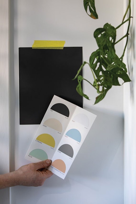
The California Collection consists of eight colors, starting with a neutral off-black hue, aptly named ‘Tar,’ and inspired by the long, black-topped highways stretched across the sprawling California deserts. This bold yet soft pigment brings cooling comfort to the walls of any room.
Sand is a neutral warm white that evokes the sensual vibe of California’s sandy shores. Citrona’s softened chartreuse is a nod towards the states’ abundant lemon trees or its 300-plus days of sunshine a year, while Palm – a pale green – is reminiscent of palm leaves catching the Californian sun.
The final four tones, Salt, Hazy, Stoke, and Faded Terracotta, allude to hot days at the beach, cool morning fogs along the Golden Coast, soft grey clouds on an overcast day, and the terracotta pottery and tiles that are so prevalent in the state’s architecture and decor.
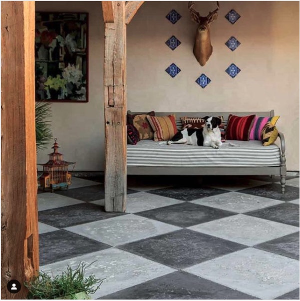
The earthy tones of Peacock Paver’s handcrafted concrete pavers make them well-matched with the natural hues of Farrow & Ball’s California range. An application of Faded Terracotta on an exterior patio wall would work well with the checkerboard effect of Peacock Pavers’ dolphin grey and slate concrete pavers, as pictured below.
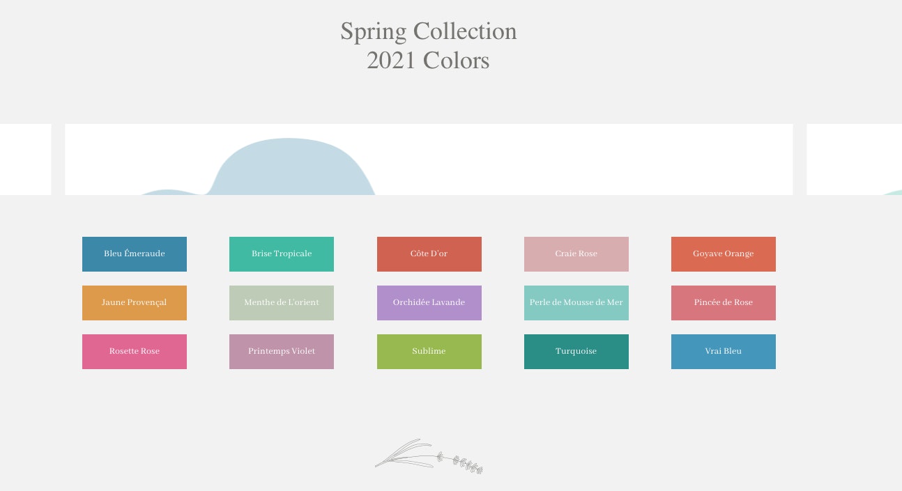
2. Spring 2021 Color Collection from L’Atelier Paris
Another popular color trend this year is unique, vibrant colors in unexpected places. None more so than the exclusive Spring Collection 21 from L’Atelier Paris, creators of elegant custom ranges, appliances, metal cabinetry, and kitchens designed to make the most discerning chefs salivate.
The creatives of this world-renowned company have developed a new, refreshing palette of 15 colorways for their custom ranges, loosely inspired by the scenery of France. These vivid colors range from Vrai Bleu (inspired by the brilliant color of the French sky) and the golden hue of Jaune Provencal to the blush-like Rosette Rose and the slightly more cheeky Sublime, reminiscent of the bright greens of new spring grass.
Again, you can beautifully offset these vibrant hues with the right flooring color, furniture, and decor selection. For example, a recent kitchen project combined Peacock Pavers’ Rice White concrete pavers with a pale green colorway similar to L’Atelier Paris’s Perle de Mousse de Mer.

3. Sherwin-Williams COLORMIX® FORECAST 2022 Lookbook
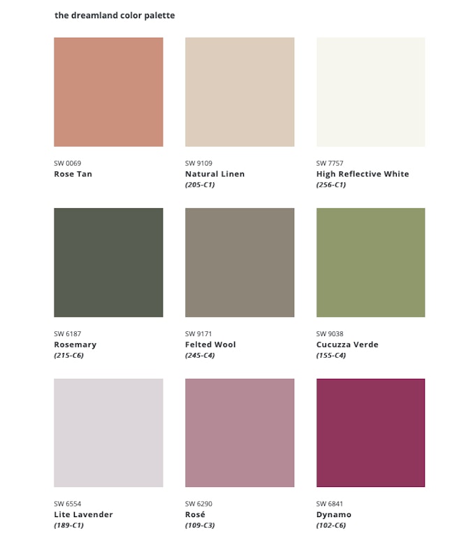
Sherwin-Williams’ carefully curated 2022 Colormix® Forecast: MODE collection comprises 40 hand-selected hues that have been each assigned to one of four color palettes: method, opus, dreamland, and ephemera.
- method color palette
The method color palette is a collection of nine earthy and natural hues and finds its inspiration in the art deco, modern organics, and 1980s postmodernism.

- opus color palette
With a nod to modern maximalism – which promotes the use of an eclectic range of textures, styles, patterns, layers, and colors to tell a rich story – the opus color palette is a bolder collection of colors, perfect for creating loud, bright, and busy living spaces.

- dreamland color palette
This dreamy color palette finds its inspiration in soft Scandinavian minimalism. Its new-growth hues are intended to inspire a sense of nurture, enchantment, and transcendence.
- ephemera color palette
This mid-century modern design-inspired color palette offers Sherwin-Williams’ color expert’s take on primary colors. These hues would work well if woven in as accent colors against a clean, simple, and functional backdrop.

There is no shortage of color inspiration for architects, interior decorators, and interior designers starting projects in 2022. Peacock Pavers handcrafted concrete pavers offer home designers the timeless look of natural stone. These pavers are available in a range of earthy tones to match any interior or exterior color scheme. Let’s take a look.
6 Stylish Concrete Paver Colors to Match Any Color Choice
Our concrete paver options include:
- Buff – a neutral color that evokes a sense of earthiness.
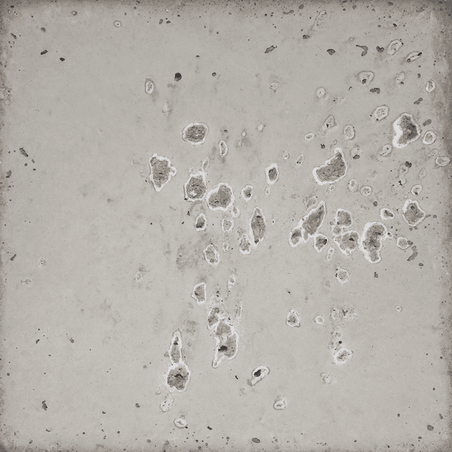
- Dolphin Grey – a versatile grey that blends well with most color schemes.
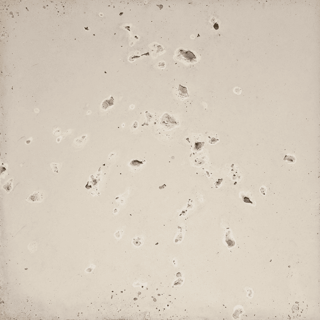
- Champagne – the undertones of this color evokes a sense of celebration.
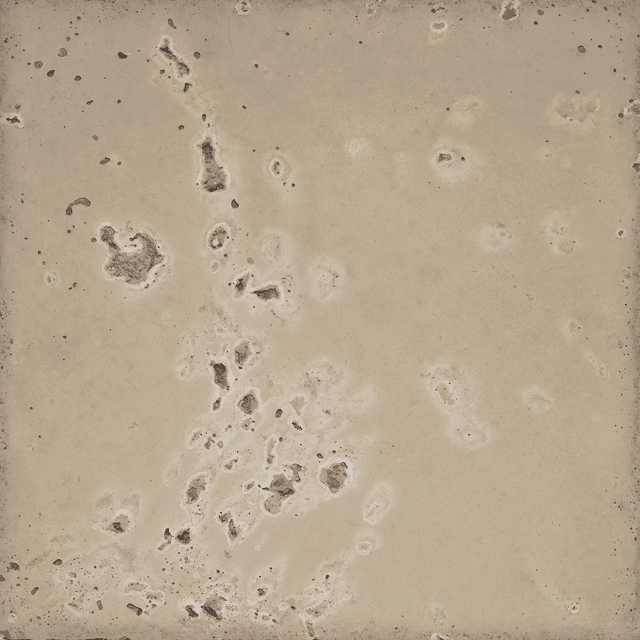
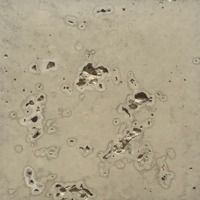
4. Oyster – the complex pigments and shades of color add interest to many different color palettes.
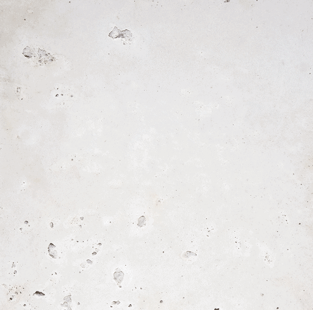
5. Rice White is one of our most requested colors. This paver is exceptionally versatile, perfectly underscoring most interior/exterior designs and serving as the ultimate floor for the popular white-on-white look.
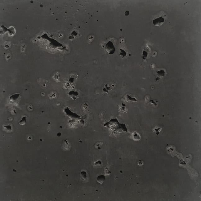
- Slate – This color’s dark grey and charcoal hues provide excellent contrast with lighter walls and other greys.
Inspiration for Incorporating Peacock Pavers Into Your Designs
Let’s look at a few real-life examples of how easy it is to color match our handcrafted concrete pavers with any color palette choice.
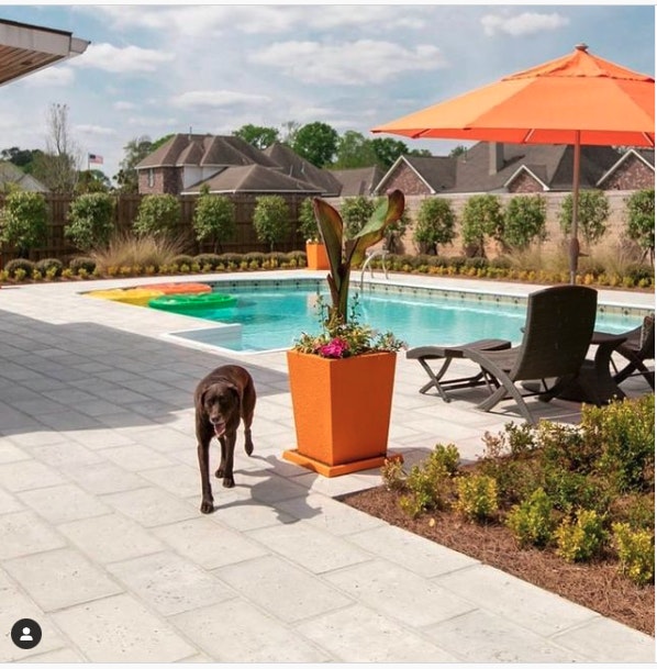
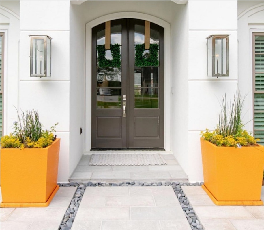
- Combine brightly colored pots and pool accessories with more earthy and neutral-toned pavers.
Pair touches of seasonally-inspired hues with Peacock Pavers’ Champagne or Rice White concrete pavers to brighten up a pool or outdoor entertainment area.
Color match options:
- Farrow & Ball: Citrona
- L’Atelier Paris: Goyave Orange or Jaune Provençal
- Sherwin-Williams: Rejuvenate
Below is another example of how a pop of color works well against the more muted and earthy tones.
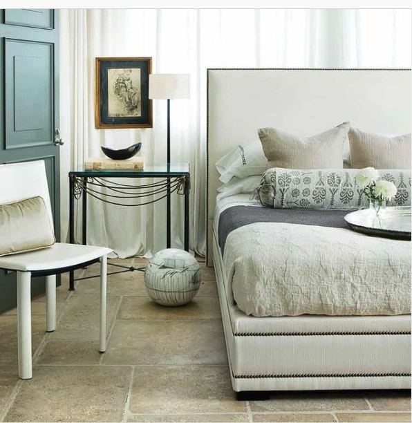
- Paint interior doors or window frames to provide visual interest, extend color schemes, and introduce warmer or cooler tones.
A painted door or window can give interest and intrigue to a room dominated by light or white hues, and an earthy floor tone can complement the aesthetic well.
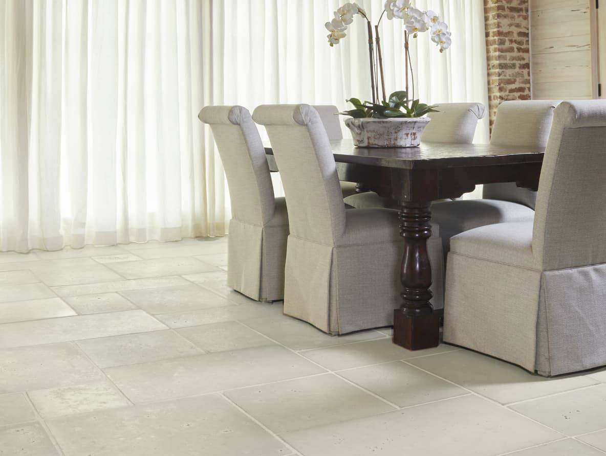
Accent colors on feature walls, doors, or tables, would work well matched with simple, off-white hues and Peacock Paver’s Oyster or Buff concrete pavers.
Color match options:
- Farrow & Ball: Hazy
- L’Atelierr Paris: Vrai Bleu
- Sherwin-Williams: Aleutian
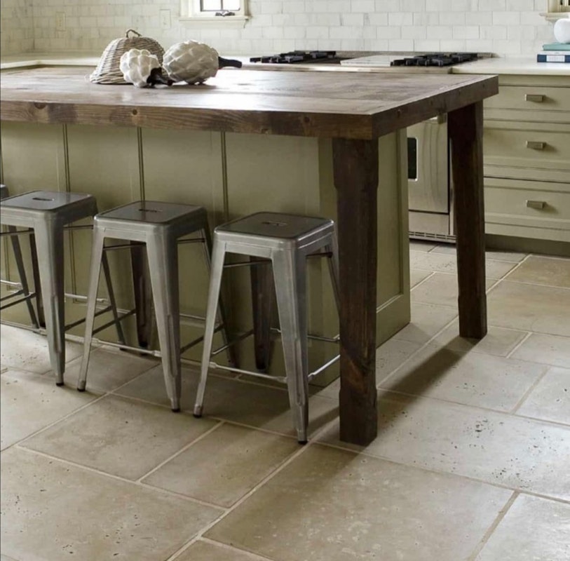
Here’s another example of how well a neutral-toned paver like Peacock Pavers in Buff works well with a hue of green similar to Sherwin-Williams’ Evergreen Fog or L’Atelier Paris’s Menthe de L’orient.
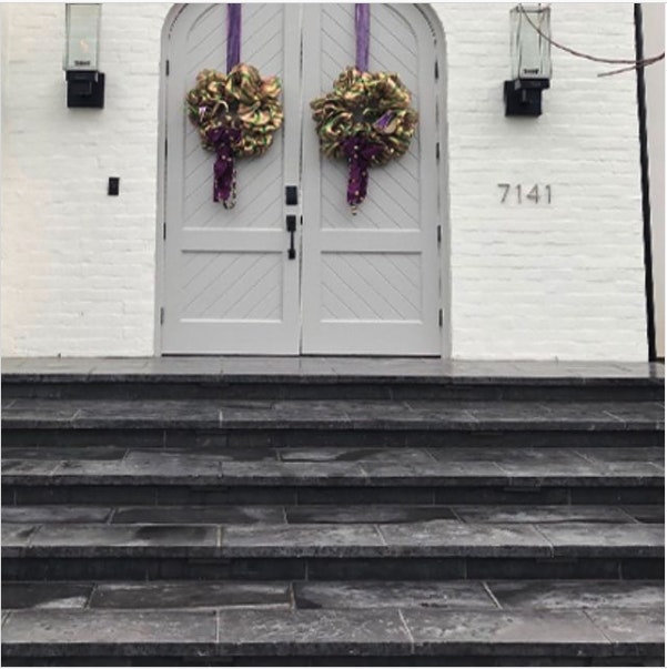
- Create contrast with darker pavers matched with white or off-white tones.
Like Peacock Paver’s concrete paver in Slate, a darker-hued concrete paver provides a bold contrast to any white or off-white exterior wall (as pictured below).
Peacock Paver’s sample kit
If you’re considering using concrete pavers for your next interior design project, the best way to ensure color schemes and flooring match is to order a sample kit from us for some color matching inspiration.
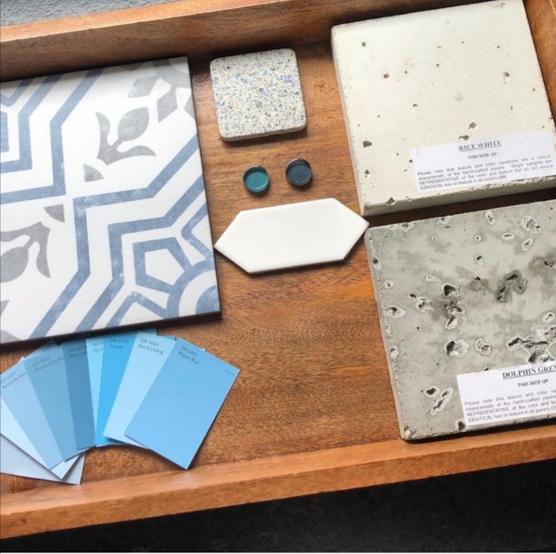
You can request up to four sample pavers in different colors and sizes to start exploring textures, hues, shapes, and our versatile concrete paver patterns.
Request a paver sample kit from Peacock Pavers today and if your home needs more color matching, contact Peacock Pavers to request a quote, we’d love to help!