 |
| 
There’s a moment in almost every paver project (usually when the first few dozen units are laid) where a homeowner looks down and thinks: wait, are these all supposed to look this different from each other? Sometimes it’s a pleasant surprise. Occasionally, it’s a concern. Almost always, it’s a question worth understanding before the project starts rather than after.
Color variation in pavers is not a defect. In high-end hardscape design, it’s often what separates a surface that looks genuinely like natural stone from one that looks manufactured and flat. But variation works for you or against you depending on how well you understand it, plan for it, and install around it.
Here’s everything you need to know.
What Causes Color Variation in Pavers?
Color variation in concrete pavers comes from several sources, and understanding them helps you predict (and work with) the range you’ll see in your finished project.
- Raw material variation. Concrete is made from aggregates, cement, and pigments. Even within the same production batch, the natural minerals in the aggregate introduce subtle shifts in tone. This is especially true for pavers designed to mimic the look of natural stone, where that mineral variation can be intentional and desirable.
- Pigment distribution. In handcrafted pavers, pigment is introduced into the concrete mix and distributed through the production process. Minor variation in how pigment disperses from unit to unit creates the kind of natural tonal range you’d expect from quarried stone, where no two pieces are exactly alike.
- Surface finish. The texture of the paver surface affects how color is perceived. A smooth finish shows color at its most consistent and saturated. A tumbled or textured finish catches light differently across the surface, which creates the impression of more variation even within a single unit.
The Difference Between Variation and Inconsistency
This distinction between color variation and inconsistency matters, and it’s worth being clear about it:
- Variation is the natural tonal range within a color family. This is what gives handcrafted pavers their depth and character. It’s the quality that makes a paver installation look like stone rather than painted concrete.
- Inconsistency it’s an unintended, irregular deviation that creates a patchy or blotchy result rather than a harmonious one. This tends to be a product quality issue more than a design one, and it’s why the brand you choose matters so much.
High-quality handcrafted pavers are designed to vary in ways that add richness. That’s a very different thing from variation that results from inconsistent manufacturing.
Why Batch Consistency Is the Foundation of Color Control
Your paver brand matters as much as the color you choose.
Mass-produced pavers are manufactured continuously in large quantities, warehoused, and sold from existing inventory. When your order is fulfilled from stock, you may receive pavers produced across multiple production runs, sometimes weeks or months apart. Each run carries its own subtle batch characteristics, such as:
- Slightly different aggregate mineral content
- Minor shifts in pigment saturation
- Small variations in curing conditions.
The result is that even within the same-named color, units from different runs can carry enough tonal difference to create noticeable inconsistencies in a finished project.
With luxury, handcrafted pavers (where each order is produced in the same batch), this problem is eliminated at the source. When every paver in your project is made together, from the same mix, under the same conditions, at the same time, the color variation you see is the natural, beautiful variation inherent to the material. What you won’t see is the jarring, disruptive variation that comes from mixing production runs.
Light Conditions Change Everything
The same paver can look like two entirely different materials depending on the light it’s viewed in, and this isn’t a flaw, it’s physics. A few things worth knowing:
- Direct sun intensifies contrast. In bright midday sun, lighter pavers look lighter and darker pavers look darker. The range of variation appears at its widest.
- Overcast light flattens and softens. On a cloudy day, the same installation reads as more unified and consistent. Colors appear more as a blended average than as individual tones.
- Morning and evening light adds warmth. The golden hour does flattering things for warm-toned pavers. Buffs, champagnes, and oyster shells look particularly rich in low-angle light.
- Wet vs. dry changes the reading entirely. Pavers darken when wet, and color variation often becomes more pronounced. This matters particularly for pool decks and areas subject to regular irrigation.
Try to evaluate paver colors in outdoor light conditions as close to your actual site as possible. A color you love in a showroom under artificial light may read differently on a south-facing sun-drenched patio, and vice versa.
Color Variation by Paver Family
Different color families carry variation differently, and knowing this can guide your selection:
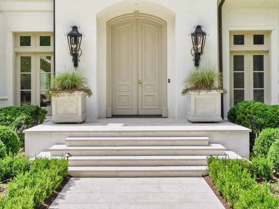
- Warm neutrals (buff, champagne, oyster shell) tend to carry variation that reads as natural and earthy. Shifts between golden, taupe, and cream tones closely mimic travertine and limestone. These are forgiving colors that age beautifully and vary in ways most people find immediately appealing.
- Cool neutrals (dolphin grey, slate) show variation in a more architectural, contemporary way. They shift between warm grey and cool grey, or between lighter and darker tones within the same family. These are stunning when blended well.
- Lighter colors show more variation visually because the eye has more contrast to read. They also show dirt and staining more readily, which is worth factoring into maintenance expectations.
- Darker colors tend to read as more consistent because contrast is compressed, but they absorb more heat and can show efflorescence more visibly in certain climates.
Read our guide to choosing the right paver color for you here.
Choose Peacock Pavers for Consistent, Handcrafted Pavers You Can Trust
Color variation is one of the defining qualities of a paver installation that looks genuinely luxurious rather than mass-produced. It’s what gives handcrafted concrete pavers the depth and character of natural stone.
Want to see Peacock Pavers’ color families in real installations? Browse our portfolio or order a sample kit to experience the color and texture in person.